Statisticians on data journalism’s sweet spot

This year saw the United Nations host its first World Data Forum in South Africa, bringing together more than a thousand data experts and statisticians to find ways to use data for sustainable development. 2017 was also the year that Tableau, a data visualization software company used by newsrooms throughout the nation announced a new data journalism curriculum. And just last week, the Wall Street Journal, Canada’s The Globe and Mail, ProPublica, and the Brazilian Association for Investigative Journalism were among the winners at the 2017 Data Journalism Awards. The awards were presented at the Global Editors Network Summit in Vienna.
With all the current fervor for big data and data journalism, what do statisticians and mathematicians think of the reporting that is being done?
We decided to ask the math and stats experts of our STATS Advisory Board, who have written about the limitations of data, methods and models, and the oft confused statistical concepts of correlation and causation.
Here is what we asked:
What do you love to see in a data-driven story or series of stories?
What do you wish journalists would do differently in data-driven stories?
And, this is what they said:
Dr. Rebecca Goldin, George Mason University, STATS Director:
My favorite data journalism stories have interactive graphics allowing the user to fiddle around a little and pursue their own questions with the data. I loved the New York Times interactive questionnaire about accents: http://www.nytimes.com/interactive/2013/12/20/sunday-review/dialect-quiz-map.html I also like heat maps where people can click on a region and get additional information. Data journalism is at its best when the data are in the driver’s seat.
Data journalism would be improved with more transparency about the limitations of the data, and more caveats about how it can be interpreted. Avoid the temptation to believe that one data set tells the whole story. What data isn’t present that may shed more light on the relationship? For example, regional test scores and housing prices may be correlated, but the relationship may not be causal, rather reflective of more parental education in the higher-performing (and more expensive) neighborhoods.
Dr. Jenna Krall, George Mason University, STATS Advisory Board Member:
In data-driven journalism, transparency is paramount. Interested readers cannot assess an article’s quality without being able to “dig deeper” into the data used and the methods applied. These details may not be necessary to communicate the main message of a story, but are incredibly useful for updating an article with additional data or information. The most transparent data-driven stories document the data sources, assumptions made, and computations performed. Documentation of data-driven stories has become much easier, and more ubiquitous, with approaches like providing detailed footnotes, placing code on repositories like GitHub, or simply linking to an external spreadsheet.
Dr. Regina Nuzzo, Gallaudet University, STATS Advisory Board Member:
I particularly love it when data journalists follow the “open science” model of transparency and reproducibility. News organizations are starting to post their data and code on GitHub; Scott Klein at ProPublica has even created a bot that tweets every time news organization opens a new data journalism repository on GitHub, called @nerdnewsrepos. One great example that comes to mind is FiveThirtyEight, which has posted data on everything from profanities in Quentin Tarantino’s films to details of police killings in the U.S.: https://github.com/fivethirtyeight/data
I’d love to see more data journalists participating in a discussion about what peer review means for data journalism. Ariani Giorgi at the Dallas Morning News and Christine Zhang at the Los Angeles Times are doing great work to get this conversation started: https://source.opennews.org/articles/peer-reviewing-our-data-stories/
Dr. Tian Zheng, Columbia University, STATS Advisory Board Member:
Describe the ideal way of data collection and the actual way of data collection. Explicitly state and explain the key assumptions made in the data analyses and to what extent the conclusion depends on these assumptions.
Journalists should ask good questions to make sure the quantitative evidence is well grounded. Just because it is based on real unaltered numbers, doesn’t mean that the conclusion is not wrong or biased because how the data were collected. They should fulfill their public responsibility by reminding readers to interpret the results with cautions and reminding readers to apply critical thinking upon every quantitative evidence they read.
Dr. Giles Hooker, Cornell University, STATS Advisory Board Member:
One theme: making uncertainty accessible. The best data stories tell you something interesting, but also give you an idea of what you don’t know. Find every-day analogies that relate probabilities to everyday experience. FiveThirtyEight was very good at finding sports metaphors to talk about their models’ predictions of Trump or Clinton victories; more creative ones are possible.
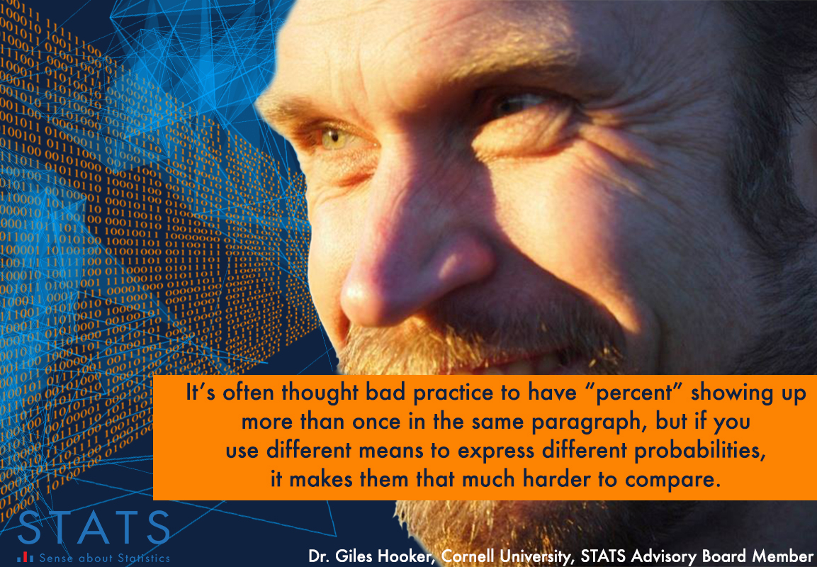
A bugbear? Quoting numbers in different ways: 75%, three-quarters, and three-to-one odds are the same, but sound very different. It’s often thought bad practice to have “percent” showing up more than once in the same paragraph, but if you use different means to express different probabilities, it makes them that much harder to compare.
Dr. Patrick McKnight, George Mason University, STATS Advisory Board Member: I love seeing figures and actual methods. Yes, I am weird but I think the data really tell the story if we are attentive to understand how they may communicate effects and uncertainty about those effects. Data visualization is key. Also, if the author prefers tabular presentations to graphical presentations, I love seeing great tables. These “great tables” are so rare that I would almost call them extinct. Most researchers never read (or heard of) Ehrenberg’s 1977 paper “The rudiments of numeracy.” Read it if you are interested: http://www1.maths.leeds.ac.uk/~sta6ajb/math1910/p4.pdf
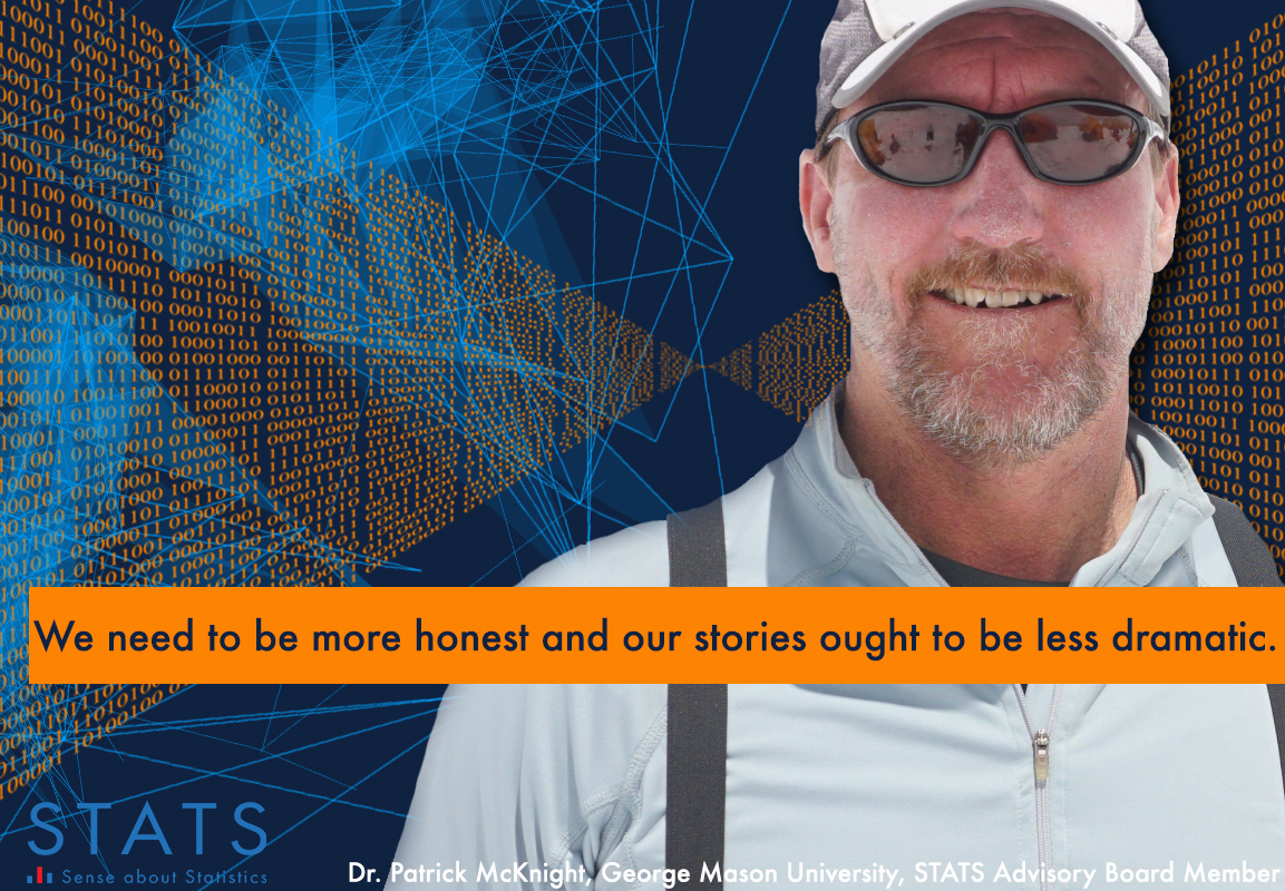
The data often take a back seat to the story. So, what I would prefer is to see some visual representation of the data that does not mask the imperfections. Additionally, I think we need writers to clearly and concisely convey how confident a reader ought to be with the general conclusion. The more I work with the intelligence community (I have several IARPA grants right now), the more I have come to realize that scientists are increasingly overselling their findings to get published. We need to be more honest and our stories ought to be less dramatic. No, I am not asking for the boilerplate bit calling for more research but instead a clear indication that the authors were thoughtful about the limitations of their findings. Also, less drama does not mean less interesting. We can still say something to the effect of “don’t sell your home on this effect.”
Dr. Kristin Sainani, Stanford University, STATS Advisory Board Member:
What I love about data journalism is that data journalists know how to tell a succinct, compelling, and accessible visual story with data. They often do a better job at graphically representing data than traditional data analysts.
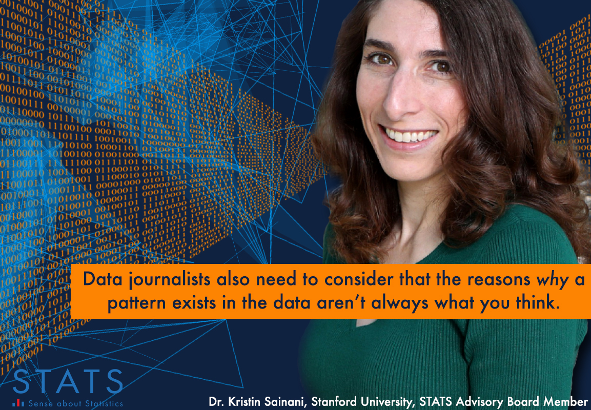
Where I think data journalists need to be better trained, however, is in dealing with basic issues in the dataset—such as missing data, data errors, and duplicates. For example, for a data-driven story on potential gender bias in science reporting, journalists compared the number of female-authored articles to male-authored articles in a dataset of 1722 articles. The problem is that only 725 unique writers wrote these 1722 articles; one male writer appeared in the dataset 81 times. In this case, the data should have been analyzed by writer or publication, not by byline. Data journalists also need to consider that the reasons why a pattern exists in the data aren’t always what you think.
Through STATScheck, STATS Advisory Board members help reporters think through the data they’re reporting on before publishing. Journalists submit queries online and are matched with a mathematician or statistician who can help them. This free statistics and data reporting assistance service for journalists worldwide is offered through a partnership with the American Statistical Association.

I found this page very helpful. I must admit that I am not a “numbers” person. I have a difficult time reading graphs, and often have to ask my husband–who thinks in mathematical equations–for help. I really think that there should be a marriage with writing and math in school. I had to write many research papers in my time, but it would have been helpful to have the requirement to add data to the writing and be able to offer the observation that there may be correlation between actions and occurrences that do not necessarily add up to cause and effect. It seems that the sentiment “math is math,” and “English is art, not math,” and therefore they should be separate is problematic. It is for me.
One of the problems with many sciences and reporting or communication with the public is that we often”confuse” our readers rather than teach them. As the genre is young we often try to use existing words with existing meanings to make “our job” easier. Later tha makes the communications harder.
For example, in nuclear physics we see these names for particles, “strange”, “God”, “up”, “down”, “charm”, “bottom”, “top”. Then there are “quark”, “anti-quark”, “muon”, “anti-muon”. I am immediately confused. I can look the new terms up (somewhere). However those in the first set already have meanings, they are mostly adjectives, the last set (I think) are nouns… but I am not sure. And the God particle is really confusing to me.
Many math niches are also fraught with “borrowed” (lazy developer?) terms that confuse the lay person, and those ‘special’ terms virtually exclude the use of the common meaning of the word in sentences with the same term used in its “special” sense. [Example: “It is going to be standard policy, without deviation, to use standard deviation to control all production runs.] I saw a one page article about 50 years ago that pointed out how the mathematical terms used to describe terms in exponents were totally miss-applied. The current terms made it virtually impossible to read a mathematical sentence aloud and understand what it was saying. The author (I wish I could remember his name) renamed the different components used in the equations. That done, anyone (even I) could read the equations out loud. It became a clear sentence in English and you could instantly understand what the equation was doing with the various components.
Mathematical equations are meant to be read as an operative sentence. This works fairly well in algebra, but some of the higher maths have neglected to chose terms for the components that fit a reasonable language structure.
For statistics this is a problem as well. I can’t remember how many times I have had to explain what the oxymoron “standard deviation” actually means… and it is one of the easiest statistical terms to justify. I remember hearing a statistician in the next office trying to CORRECT a potential customer who was using common terms like, “standard”, “average”, “sample”, “normal”, “variance”, et al. At each term she used in trying to explain her “real” problem, the statistician was trying, with no luck, to tell her what those common words meant to him, as a statistician. After about twelve minutes, of what she viewed as simple arrogance and personal harassment, she got up and stormed out of the office. Customer lost.
The problem is a broad one. These ambiguous multi-meaning term should be replaced in statistics with unambiguous terms. Those terms should turn the written formulas or statistical equations into readable sentences. Replacing them one at a time will be a waste of time. The entire structure has to be changed.
I suggest that a group (mostly statisticians… but not all) with broad background experiences should be tasked and funded to “translate” the Statistical equations into sentences. Perhaps, to begin, they could just use Greek characters to act as space-holders for the future names (invented nouns) of the various functions. Then they should make up NEW words to use for those functions. Then read all the equations with the new names, and see if the formulas read easily and sound nice in English. [They might also want to test them in other languages… just to be safe.. no cultural offenses.] When any of the “formulas” offend or just don’t “sound right”, replace the most “offensive” with a new invented term and try again. This task might be done in a week or so, or it might take a year or longer… but don’t be in a hurry… if successful you will be changing the world. Each ‘prototype’ result should be beta tested with groups of individuals of different age, ethnicity, education, background, etc., etc., before publishing the results. And, the first publication should be a comment DRAFT. And, perhaps the next, also. Once a base system is approved by the ‘team’ it should be tested, and tested, and tested, with ever-widening groups. [[What is the reason for all the testing?: A SECRET: the following is a secret “marketing ploy”, stop reading here if you are not a participant in this process. ||||| OK, When you ask someone to Test and Comment on something that is “new and/or improved” they will feel like they own some small part of that process, system, or product. When you develop and finally release that “good” product, the more testers that you have used in that development, the more people you will have out there promoting that product for you.]]
Just a suggestion,