Design for
statistical
understanding
What happens when a textbook approach to learning doesn’t work with scientists? We brought a top medical journal and a leading data visualization company together to try to explain a key statistical concept and solve the problem of missing data in clinical research
Trevor Butterworth
“Design is not about creating beautiful things, it’s about solving problems.
It’s a user-centered discipline…”
—Giovanni Magni, Data Viz Designer, Accurat
In 2017, we were contacted by the Annals of Internal Medicine with a proposition: could we help to devise a way of communicating important, but frequently misunderstood, statistical concepts to clinical researchers?
We had been working with the American Statistical Association to do something similar for journalists, but clinical researchers were outside our mission parameters. Still, we understood that this was the upstream problem to the downstream problem we were trying to solve.
The “statistical deficit,” as Jeffrey Flier, former Dean of Harvard’s Medical School noted at the National Academy of Sciences, was a serious problem in biomedicine; we had heard many horror stories from statisticians about clinical researchers experimenting without sufficient statistical awareness; and we had heard, too, from medical students frustrated with what they saw as inadequate training in statistics.
We had been tackling the statistical deficit in journalism. The more journalists understood the importance of study design, data collection, and data analysis to the integrity of the experimental process, the better questions they could ask, and the more they could hold science accountable and explain why some scientific claims were robust while others were not. That was the rationale behind STATScheck—a free service for journalists where academic statisticians would “fact” check claims about data—and our STATS workshops in newsrooms, journalism schools, and scientific societies.
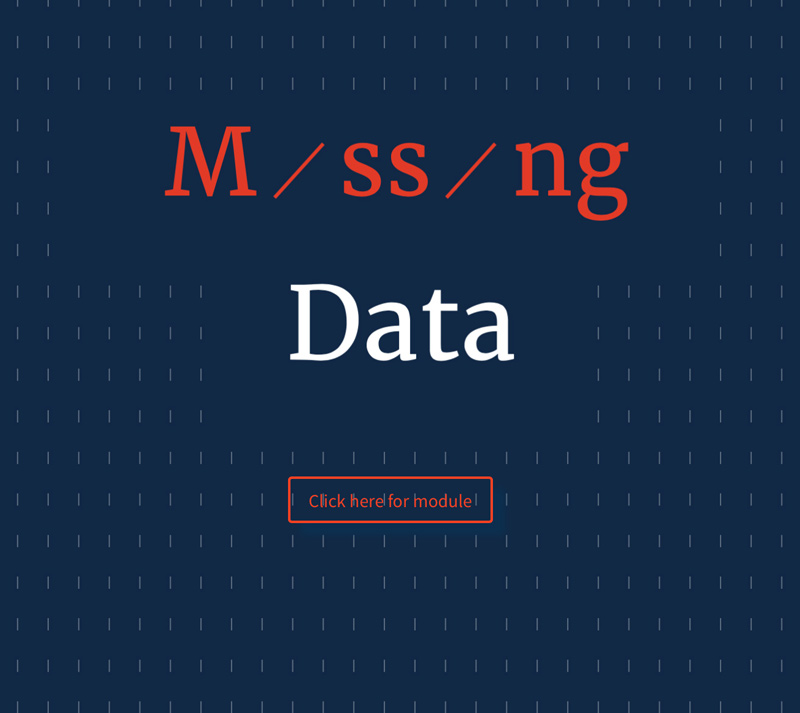
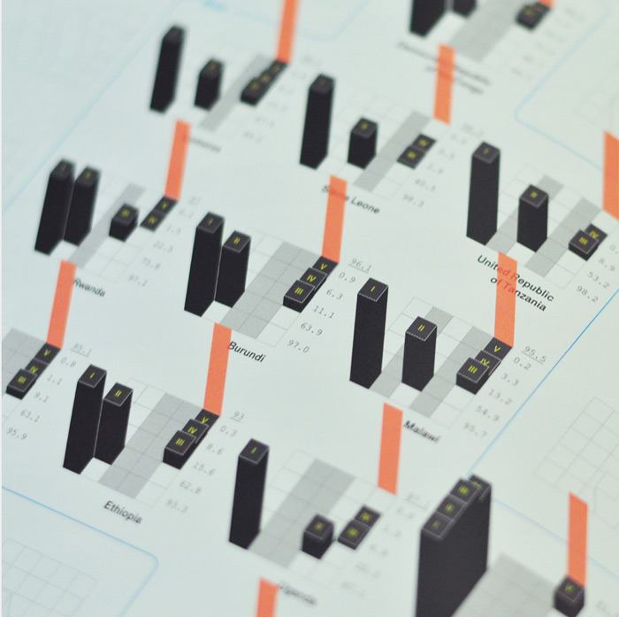
Click on the image to go to the module. Key concepts are in the left pane, explanations in the right.
Content updates as you scroll down the page.
“There’s a trove of insightful material out there. But, somehow, all this text is not reaching its intended audience in such a way that they learn from it: the same mistakes were showing up in submitted research again and again.”
But it made sense to deal with these issues upstream too. Journalism is a thin blue line for correcting poorly designed, measured, or analyzed scientific research—and it’s getting thinner.
That was the theoretical justification for proceeding; in practical terms, Annals’ problem was just really interesting in terms of science communication: There is no shortage of studies and reports about how to account for missing data in a clinical trials; in 2010, the National Research Council published the recommendations of an expert panel convened by the Food and Drug Administration on how to deal with missing data. There’s a trove of insightful material out there. But, somehow, all this text is not reaching its intended audience in such a way that they learn from it: the same mistakes were showing up in submitted research again and again.
Might this be a user-experience (UX) problem? Might there be a better way of communicating to researchers the basic warnings about missing data, and the tempting fixes that are, in fact, wrong? Our view was, let’s experiment! Let’s do so with the help of one of the world’s top data visualization companies—and let’s see what we learn by getting statisticians to work with designers.
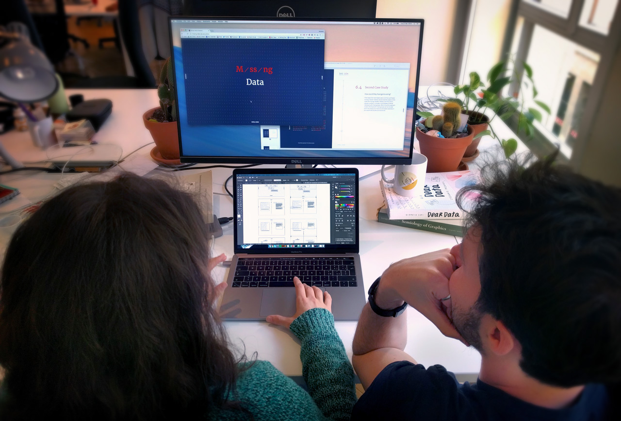
—Elisa Spigai, Interaction Designer, and Giovanni Magni, Data Viz Designer, work on Missing Data. Photo, Accurat
So, what did we learn?
We would say that statisticians expend so much energy and focus on addressing the needs of other statisticians (to establish methodological consensus) that there is little or no bandwidth left to address the needs of non-statisticians. Statistical communication, at least in this case, was practitioner-centered. This isn’t a complaint: it’s an understandable obstacle arising from a shared, understanding of the complexity of the subject.
The challenge for the field of statistics is that there are many, many potential users, from scientists to policy analysts to journalists, all of whom need to be able to reason statistically such that they reach a point where they know when to engage a statistician (of which there is a limited supply). This is why statisticians need to work with designers. As Giovanni Magni, lead designer for Accurat put it:
“Design is not about creating beautiful things, it’s about solving problems. It’s a user-centered discipline focused on peoples’ needs that relies on aesthetics to convey messages and organize content in readable, understandable, or explorable ways. Design gives access to things, it does not make them look nice.”
For us, the key word here is “access.” Designers have access to a dimension of expression every bit as precise and detail-oriented as statisticians, but which is hard for statisticians to imagine from a place circumscribed by the precision of text and mathematical notation, and the need for accuracy and reliability. Getting statisticians and designers to work with each other is a process of each learning what is possible to say within the language of design, and how that language can allow others to access statistical meaning.
As Magni puts it, designers “need to understand that reliability and accuracy will always be more important to statisticians than any kind of visual transition or UX feature,” but at the same time, designers need to use their skill to explain why these aspects cannot be ignored from a user perspective.
The next step is to see how this module on Missing Data works as a teaching tool (and we invite researchers and statisticians to comment below on how we might make this module better).
The important thing to keep in mind is that we have tried to build a better basecamp in the ascent to statistical insight; we hope that it will inspire others to imagine the next stage of the ascent—and to trigger a wider discussion in statistical and scientific education about the importance of design, user experience, and access to meaning.
How can we improve this? Let us know!