
The Graph That Launched a Thousand News Stories

Statistics is the science of learning from data, and of measuring, controlling, and communicating uncertainty Thoughtful analysis and honest, effective communication of data are hallmarks of good statistical practice. At the intersection of data communication and statistics, many collisions occur, as a hearing in the U.S. House of Representatives last week illustrates.
On the opening day of the U.S. House of Representatives September 29 hearing on the funding of Planned Parenthood, a graph was displayed to make a critical point. This is common, as effective communication of statistical information often occurs through graphs. Good graphs highlight and communicate the important relationships among the numbers. Deceptive graphs obscure or even contradict the messages from the numbers.
The graph used at the hearing, shown below, was displayed only briefly and at a distance. Although numbers were used to label points on the graph, those numbers were not shown large enough or long enough to be readable; the impression from the data was conveyed by the picture alone. That picture is a deceptive representation of both the actual numbers and the trends in abortion services and prevention services carried out by Planned Parenthood.
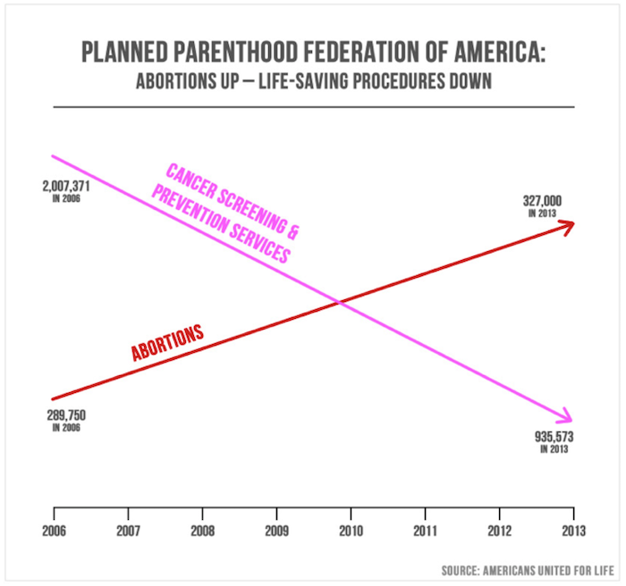
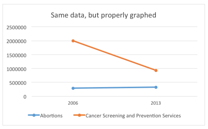
The visual impression is that abortions have dramatically accelerated and overtaken cancer screening. The lines suggest that screening has declined as quickly and radically as abortions have increased. These erroneous impressions are achieved by choosing to draw lines that have no relationship to the numbers, because the y-axis scale is different for the two lines. In fact, cancer-screening services in 2013 outnumbered abortions by 3 to 1. Here is a graph that uses a consistent scale for the vertical axis.
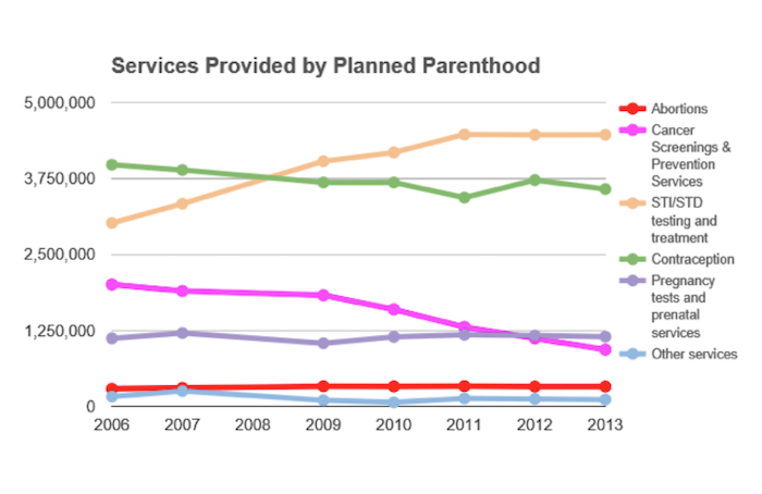
Graphical deception can also occur through the selection of what to display, and what to omit. The first deceptive graph illustrates data from only two categories of services, representing only 10 percent of all services performed by Planned Parenthood. A graph that includes the omitted data looks like this:
Source: Politifact
Graphing data of wildly different sizes requires careful thought. With any data, good reporting also asks questions about the actual size of the numbers and the relative size of numbers. For example, these data might be better understood per capita rather than as total numbers; that is, instead of simply reporting the number of cancer screens or abortions carried out, one might report the number divided by the whole population. One would not compare the actual number of traffic accidents in two different cities of very different sizes; the sensible comparison would be the rate—the number of accidents divided by the population of the city.
Deceptive graphs know no political bounds. Last year Obama administration officials from the Department of Veterans Affairs (VA) were called out over the graph below, which contains one of the errors commonly made in bar graphs: not starting the y-axis at zero. This leads to a visual impression of greater change over time than is actually present in the data. The Congressman who noted this error, Rep. Tim Huelskamp, R-Kansas, decried the irony of the VA using this graph while also teaching staff members statistics using the famous book by Darrell Huff, “How to Lie with Statistics.” The chart also uses dual axes, which can further complicate interpretation.
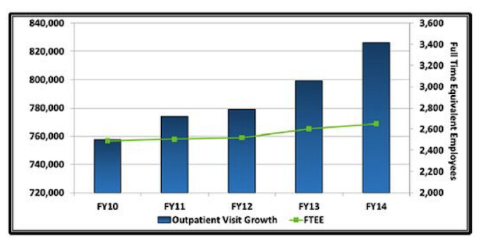
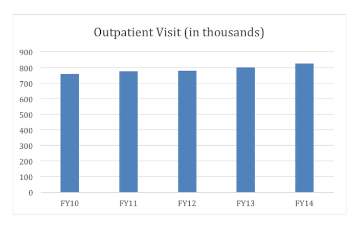
What does this graph communicate? First, it suggests that from Fiscal Year (FY) 2010 to FY2014 the number of outpatient visits more than double —the tallest box is more than twice the size of the smallest one. Second, it suggests that growth in the number of employees has not kept pace with the growth in outpatient visits.
In fact, the actual increase is more like 8 percent over the time period. A corrected bar chart, in which the y-axis starts at 0 rather than 720,000, more accurately depicts the rate of change of outpatient visit growth—as shown below.
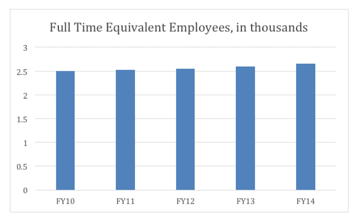
Now take a look at the change in the number of full-time equivalent employees:
Here’s a graph that reflects this more clearly. It plots growth in both visits and employees, as a percentage of FY10:
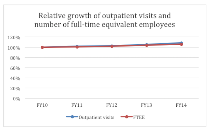
The number of outpatient visits grew faster than the number of FT equivalent employees, but by 2 percent or so, much less drastic than what is shown in the VA’s graph. (Note: STATS approximated the figures used in the graphs above based on the VA’s graph, since the actual data were not presented.)
Accurate graphical representations of data make the “big picture” easier to understand. But poorly drawn graphs, by accident or by intention, misrepresent the data and mislead the viewer. In the cases of the Planned Parenthood graph and the VA graph, there can be little doubt that the graphs were designed to tell a story that the numbers do not tell.
George Cobb is emeritus Professor of Statistics at Mount Holyoke College. He received his undergraduate degree from Dartmouth College, a masters degree in biometry at the Medical College of Virginia, and a PhD in statistics from Harvard University. He was elected a Fellow of ASA in 1993, served a term as vice president, and received a Founder’s Award in 2006. His interests include statistics education, applications of experimental design, and applications of statistics to the law.
Please note that this is a forum for statisticians and mathematicians to critically evaluate the design and statistical methods used in studies. The subjects (products, procedures, treatments, etc.) of the studies being evaluated are neither endorsed nor rejected by Sense About Science USA. We encourage readers to use these articles as a starting point to discuss better study design and statistical analysis. While we strive for factual accuracy in these posts, they should not be considered journalistic works, but rather pieces of academic writing.
Excellent post. I’m forwarding it to all the middle school math teachers I know for an example of why they need to understand statistics
Please don’t it’s lame for students
how do you make the fourth graph not misleading
Excellent post. I’m forwarding it to all the middle school math teachers I know for an example of why they need to understand statistics
Please don’t it’s lame for students
how do you make the fourth graph not misleading