Want to change the world?
Give kids data
Make it relevant to their lives—and give
them tools for visualization
Trevor Butterworth
Photo: izusek for istockphoto.com
We’ve shown, through access to large and relevant data sets that kids “can do things we thought were too hard for them.”
—Jim Ridgway, Professor, School of Education, Durham University
They were not the best and the brightest; they were not from elite schools or gifted programs; and to their teachers, they were not marked out for academic success. They were the muddle-alongs, the bored, the not good and never-likely-to-be-good at math.
And yet, within a matter of hours—and with no prior conceptual knowledge or study worth speaking of—these kids were interpreting data of the complexity normally associated with college programs. In some sessions, they were asked to assess media coverage of the same data, and the kids sometimes surpassed the reporters and editors in analytical sophistication.
Three hours. That was the length of the sessions developed by the researchers, James Nicholson, a former math teacher and chair of the International Statistical Literacy Project advisory board; Jim Ridgway, a Professor in the School of Education at Durham University, who had been leading a project to develop tests for math and science thinking that might identify children in socio-economically deprived areas as potential STEM students; and Sean McCusker, an engineering graduate, with a PhD in Civil Engineering, who had moved into educational research, and is now at Northumbria University.
If there was a downside,says Nicholson, it was that once the kids started to talk about what the data meant, the sudden enthusiasm for exploration led them towards over-interpretation.
When Nicholson was young, mathematics just made sense—so much so that he would acquire a degree in math from Cambridge University, teach at one of the most prestigious private schools in the United Kingdom, and then in a large academically selective school in Northern Ireland. But even here, in the U.S. equivalent of prep school, not being good at math was an open club.
Nicholson’s insight was that it might not be the kids’ fault: as he puts it, if you stepped back from the grind of teaching and thought about the way the textbooks and the curriculum explain concepts—and the way testing examines knowledge—the system wasn’t doing kids many favors in making sense of things. As Nicholson began to get involved in mathematical and statistical education, he became more convinced that kids were not being taught in a way that allowed them to engage with the reasoning behind the concepts.
“It was very procedural, very mathematical, with no particularly good articulation of why you were doing things,” he says. “Concepts like independence and probability were just stated without a lot of exploration as to what independence meant contextually. Everything was discussed as one variable or two variables with a straight line. That doesn’t describe a whole lot of the real world.”
It wasn’t just an excess of abstraction; when statistics referred to the real world, they did so in unreal ways. In one exam question, students were presented with data showing temperature changes as altitude increased, a well-known phenomenon understood by hikers and mountaineers. Unfortunately, the phenomenon was not well understood by the examiners, who created an implausible set of data for the test takers to analyze. Students who answered the question correctly would end up with a result that made no sense if they had ever hiked a mountain trail, a result that, if reflected upon, might prompt them to retrace their calculations, thinking them in error.
Other test questions followed a similar pattern: Calculate the mean from a frequency table but ignore the actual relationships between the ‘real world’ data and the real world—a children’s book in which all the words were four, five, or more letters. It takes a certain imagination to conceive of a book for children without conjunctions, definite or indefinite articles, and most of the prepositions we use to glue thoughts together into expression, and it takes a distinct lack of imagination to miss the bigger story being told through these kinds of surreal questions: The more you, as a student, regurgitated without thinking, the more likely you were to get the question right, and the more you were likely to think that statistics was an unworldly and largely useless practice. Stop and think logically and you risked confusion. Obviously, this style of teaching and examination presented few obstacles to those with an instinct and a liking for math; they accelerated past freezing hilltops and unreadable books into the mechanics of the concept, as their teachers and examiners did. But what of everyone else?
“I think context is extremely important,” says Nicholson. “The right examples can make a huge impact on how kids think about things—and more importantly what sticks.”
“The right examples can make a huge impact on how kids think about things—and more importantly what sticks.”
James Nicholson in his Belfast study.
Photo: Trevor Butterworth
Context was also a way of breaking into the analysis of multivariate data, which is to say, being able to work with more than two variables. In the real world, problems are almost always multivariate and often non-linear (the relationship between variables isn’t a simple straight line). Typically, this sort of analysis was the domain of university courses and ‘black box’ computer techniques. A student would feed their data into a program and then wait for it to spit out a regression (the relationship between the variables), which the student would then try and interpret.
The problem with this approach says Nicholson is that it didn’t allow you to visualize the relationships in the data. “If you could see the behavior, then the interactions are very obvious,” he says. “If you use the right sorts of context, they were accessible.”
In the background, several important developments were taking place: more and more data sets were becoming available, and more thought was going into tools for visualization and interpretation. In 2004, Nicholson, Ridgway, and McCusker began to go into schools armed with data and work with small groups of students to try and understand what was causing them problems. They kept iterating until they got the right mash up of data to unleash the kinds of questions that would get at the reasoning behind the concepts. They used data that directly spoke to the kids experience—drugs, educational attainment, sexually transmitted infections, smoking, obesity, poverty—with data on teen binge drinking offering the most engagement, not least because it was being treated in the media as a national scandal.
If you followed the headlines at the time, British adolescents were busily recreating Hogarth’s Gin Lane: teenagers had never been so boozed up, and the adult response—as channeled through the media—was that they urgently needed to be educated by their schools about why alcohol was bad for them, which would then—so the assumption went—lead them to moderate or stop.
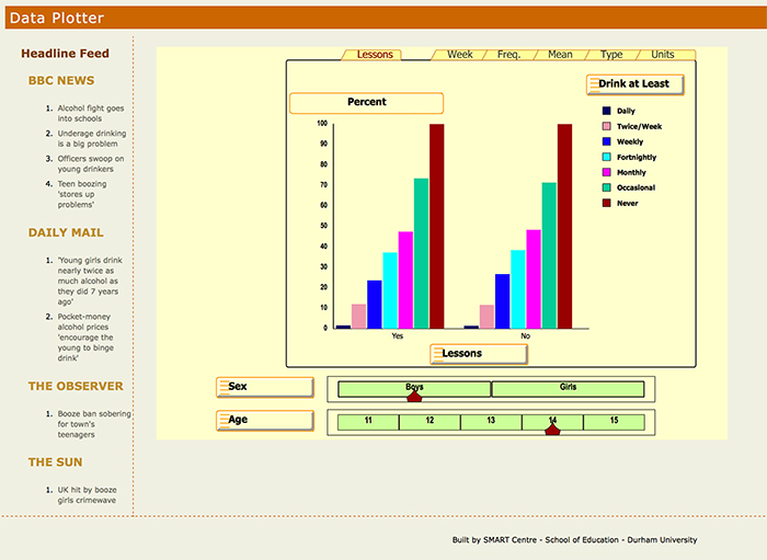
The students were given data sets for their and previous generations’ alcohol use, along with evidence for the effects of lessons on alcohol consumption; and they were given an interface— comparative bar charts with sliders—so they could visualize the relationships between data. In some of the sessions they were asked to write news reports or opinion pieces that contrasted their findings with those in the real press.
They used data that directly spoke to the kids experience—drugs, educational attainment, sexually transmitted infections, smoking, obesity, poverty—with data on teen binge drinking offering the most engagement…
The Interface
The challenge of communicating complex information is that it is either oversimplified or it ends up retaining most of its complexity, says McCusker. The first path leads to misunderstanding, the second, to not understanding at all.
“We need,” he says, “to look at the idea of evidence and its dissemination as one construct.” This is where his engineering background comes into play, literally. “What people need is to play with the data, to get a feel for it.”
The interface to the alcohol data set made it transparent, “so that the kids immediately engage with the messages within the data rather than with the complexity,” he says. The kids aren’t even aware that they’re doing something they don’t normally do, which is to interact with multivariate data.